As UX Designers, we already know that we need to focus on the users and their needs. That’s true, but it’s not enough. As a UX Designer, we need to be aware that our job impacts the business model.
Therefore, I encouraged and decided to share with you 7 tips to improve your landing pages, which means more money in your pockets or more happy customers.
First, What is a landing page?
If you’re a beginner, don’t be afraid. Everyone was a beginner at one point… So you’re wondering about: What a landing page is?
Well, with a quick search on the internet, we find “a landing page is a standalone web page”, “A landing page is a page on your site that is designed to convert visitors into leads.”
That’s it! The important thing here is that a landing page has a goal: conversions.
*A conversion is when users who navigate your website (Traffic) interact and complete the desired goal, such as buy a product, register, download an app…
As well as UX Designers, we need to pursue this goal working at the same time with the marketing team.
1- Give users a clear value proposition.

Often, as artists, we feel the responsibility to “decorate” the website, but you need to remember that if your design doesn’t show the value proposition clearly, you must be considering removing it.
This doesn’t mean that a modern and creative design is a bad idea, I want to say that a good design exposes the value of the product or service in a way that engages with the users.
When you’re designing, consider these questions:
- Does my design help the value proposition?
- Can the people clearly understand the value proposition?
You will need to balance the user experience, a good design, and keep or improve the business model.
Let’s talk about an example.
Look at this website—can you know quickly what they’re offering?
I need to stay on the website, read and spend time to know what they’re offering. Users’ attention is short. Rarely, a user that doesn’t understand the value proposition in the first 5 seconds will continue reading.
Doesn’t matter how good or bad it looks if the value proposition isn’t clear. You failed.
2- Call-to-action (CTA) on each section.

Sometimes we think that giving a call-to-action on each section can be overwhelming. It’s not true because each section covers pain points to encourage users to convert.
So, how can someone interact and convert without a call-to-action?
Without CTAs, We don’t have customers or leads, and without leads, there’s no business.
I will talk about CTA later, but keep in mind that they need to be engaging, clear and eye-catchy.
3- Use call-to-action to engage.
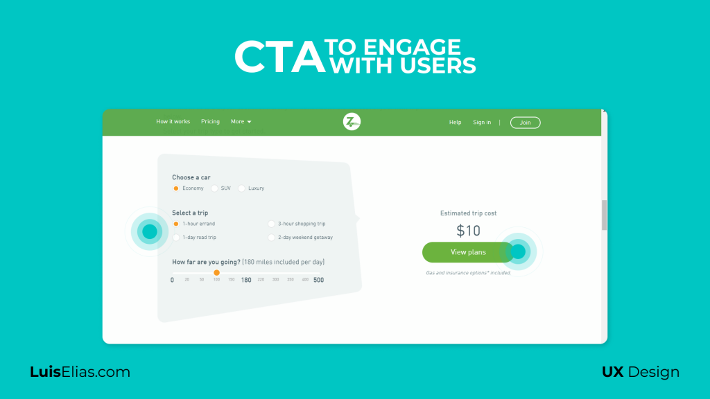
To understand this tip, we need to explain with a traditional example…
Imagine that you’re creating a landing page for an insurance company. How is the traditional landing page for this type of agency?
We will find an informative or corporate web page with a lot of text, large paragraphs, and info that don’t connect with the user’s needs.
Think about the buttons. We will find buttons called “Vision”, “About us”…
Now, think about the user, do you think that they will read all this information? Absolutely no!
Most of the users will scan the webpage, searching for keywords or something that gets their attention.
How can we create call-to-actions that work? Common buttons tagged as “Register” “Get a quote” can work, but It’s not enough nowadays.
Instead, what do you think about a horizontal bar with a headline that says:
How much money do you want to save?
Of course! Everyone will want to save money as much as possible. So probably the user will set the max amount of money and will click on “Begin now” or “Start saving”.
When you focus your CTA around users and explain in an easy way how your product or service will help them, then you will increase conversion rates!
As UX Designers, we need to give users what they need, and give the business model their part, too.
Everyone wins! Don’t you think?
If you want high rates of conversion, never focus on how good your business, product, or service is. Instead, talk about how it affects the user, and how can improve their lives.
4-Sections with the right dimensions.

It’s our responsibility as UX designers to create sections along the landing page that fit well.
Let’s see an example…
Sometimes we forget about the viewport of the content and we design content that cuts off the CTA.
Imagine a classic section with an image/illustration aside by a paragraph. In this case, the paragraph is too long and the button is cut off in this view.
Therefore, users need to scroll down to click on it. This simple stuff can decrease the conversion rate. Remember that users usually scan the content, so it’s important to put the pain points in the same page that the call-to-action.
Users will find an easier way to get what they need.
5- Hick’s Law and conversions
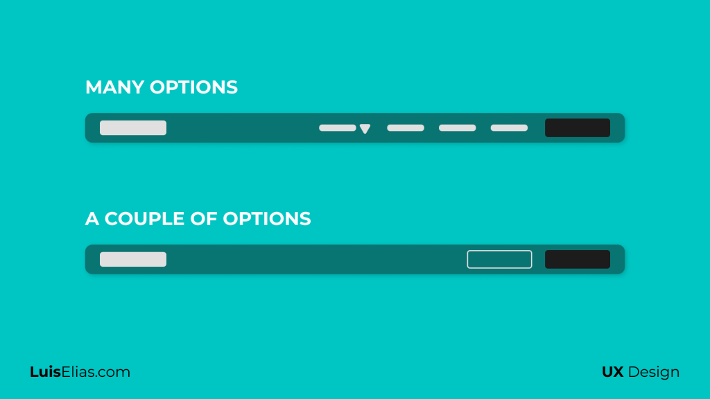
If you don’t remember Hick’s Law, this says about:
The time it takes to make a decision increases with the number and complexity of choices.
In this case, we need to reduce the number of options available on the landing page. We need to put only the important ones.
Each option that you add on the webpage, it’s an exit door to lose users. Add all competent info on the landing page, and try to solve the user need giving them the right information.
One way to improve this, it’s creating single footers without a lot of options that can encourage users to get out of our landing page, but if you need to add anything there, don’t forget to open these links in a new tab.
—
If you’re still reading, let me give you the most important tips, keep reading.
—
6-The headline is the most important thing on your landing page.

I want to quote Neil Patel (A marketing gurú that I invite you to read if want to learn more about marketing stuff) He says:
8 of 10 people read the headline, but only 2 of 10 people read the rest of the landing page.
So, you can create the best landing page ever, that if the headline isn’t good enough, you will lose traffic.
I know, I know, as a UX Designer it isn’t your responsibility for this headline, however, it is our goal to create a perfect layout, design, the right typography, and more to create the perfect headline.
This headline needs to be human, connect with users and their needs, and encourage them to interact with the call-to-action.
Keep in mind, if your users don’t understand what your landing page is offering in the first 5 seconds, something goes wrong.
Remember: It’s most important to show what the product or service can offer to users than highlight the company characteristics.
7-Jakob’s law.

What says this law?
Users spend most of their time on other sites. This means that users prefer your site to work the same way as all the other sites they already know.
What does that mean? Well, I understand as a UX Designer, sometimes we feel that we need to create something new, never seen, but often we need to avoid be too creative.
Why do you want to reinvent the wheel? Don’t do that!
David Rusenko (CEO of Weebly) in his speech about “Product market Fit” (You can see the conference on Youtube here) He mentioned an experience about improving the registration process.
They (Weebly) created a registration form in the hero of their website, they thought that if the form is simplified with only two fields it can be easier to fill out.
Guess what? When they tested it, they saw that people can’t find the registration form!
The users report that they believed that this form was a login form because a registration process always contains more than 2 fields.
Remember one more time, users don’t read, they just scan the site.
How do they solve this issue? Simple, they add an extra field on the registration form, and the conversion rate increases one more time!
Give the users something that they already know.
—
Did you like this article? If you have any comments or another tip, please leave your opinion in the comment section!
Check out my website luiselias.com and follow me on Twitter and Instagram! Let’s go to learn and improve our skills together!