It’s a great idea to see what other people do to find patterns and get inspiration. When we talk about UI, it allows us to gain interesting insights into digital products that people use globally. As someone once said: “If I have seen further, it is by standing on the shoulders of giants.”
So, let’s do that!
I chose three major food delivery apps used by millions of people. Let’s explore their checkout processes, including the number of steps, similarities, unique features, and more.
Clarifications for this analysis:
- Where does the checkout process start?
The analysis begins from the basket (the page overview where all products are already added). - Which steps are considered in the checkout process?
This analysis focuses on recurring paths where payment, discounts, and addresses are already saved, ignoring new payment, coupon, discount flows, and new address entries. - What type of checkout process is considered?
The focus is on delivery orders only, excluding pick-up or dine-in options. - Is long scrolling considered?
No, long scrolling is not considered. While many apps use long scrolling to reduce steps, the analysis counts steps without implying the process is concise. Pay attention to each detail. - Why am I doing this?
I’m not the ultimate authority; I just want to share insights from other companies for the community’s benefit. Those working in tech can learn new or interesting ways to build a checkout process. Enjoy!
Uber Eats
Uber Eats is a food delivery platform that connects you with local restaurants, making it as easy to get food as it is to request a ride.
Checkout Process:
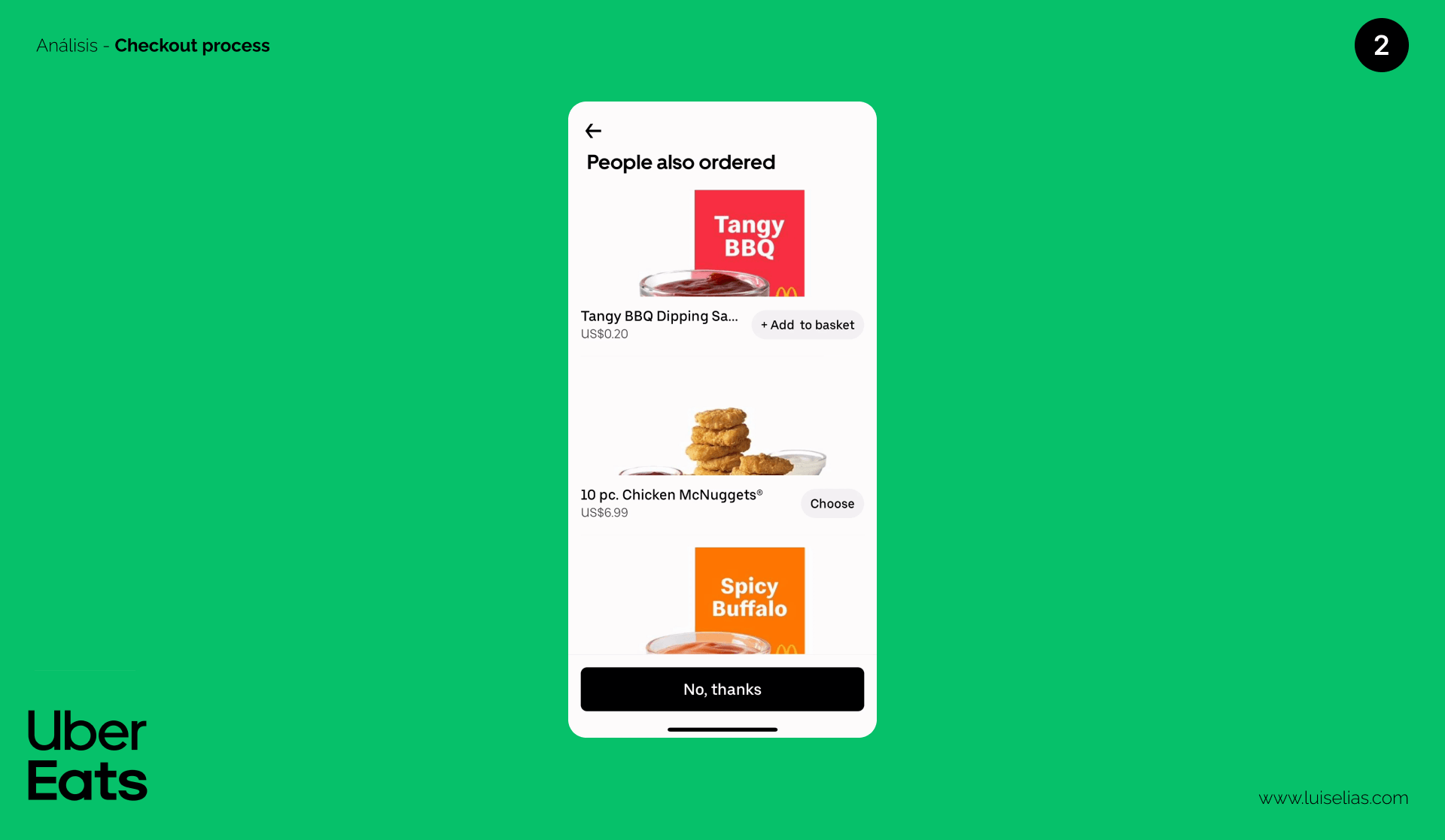
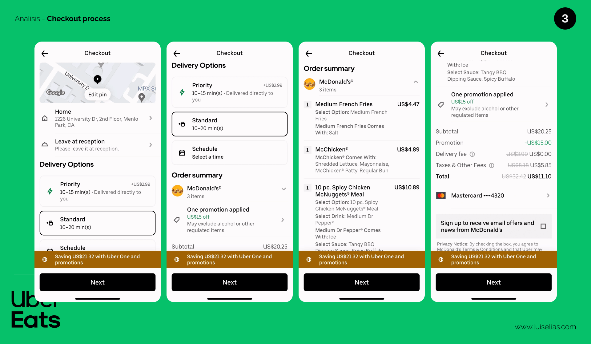
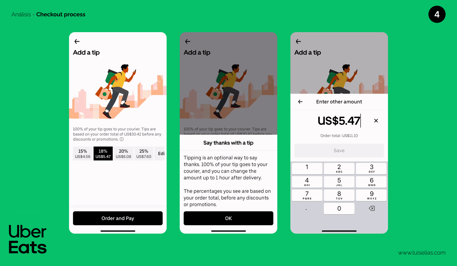
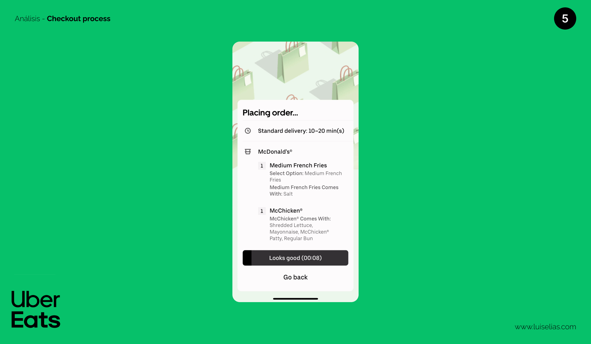
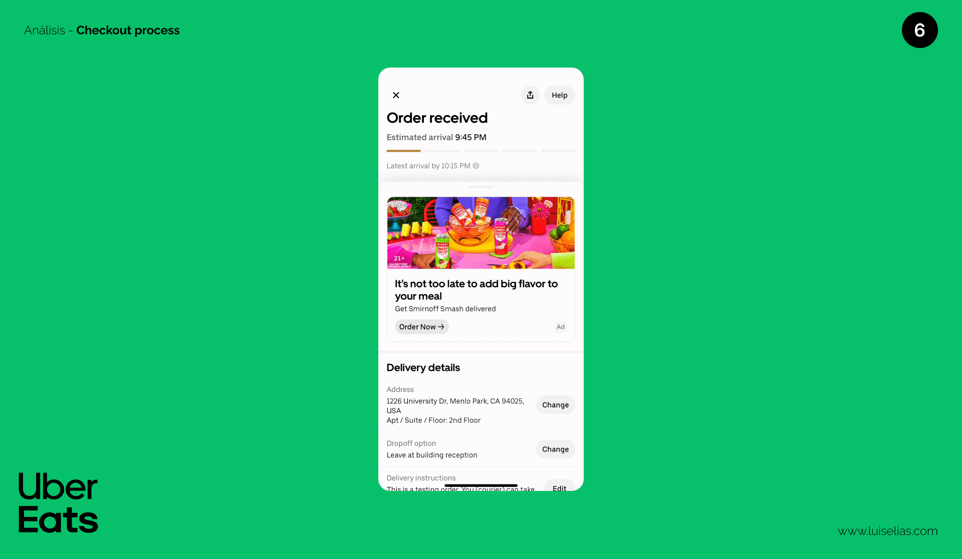
Steps: 6
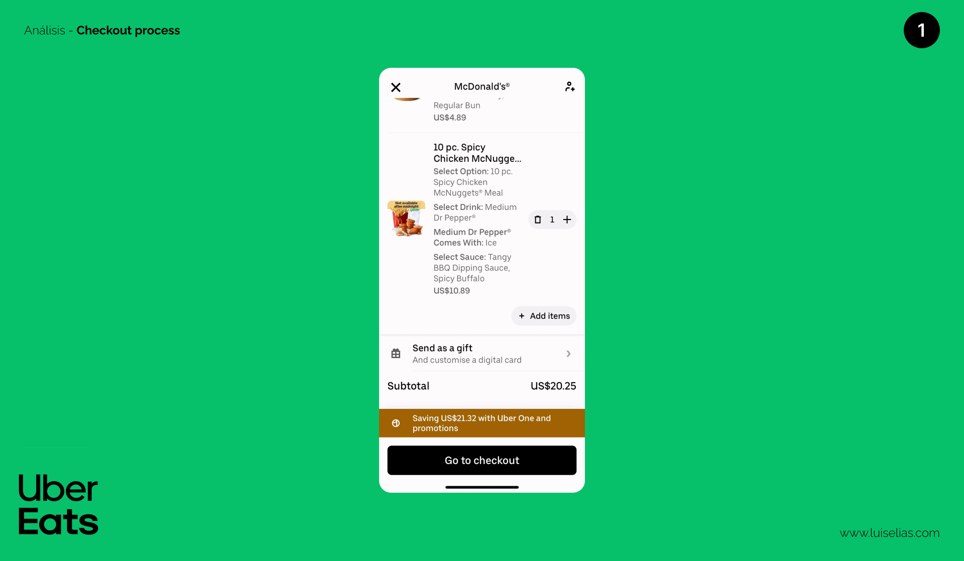
Pros:
- Consistency throughout the flow, with similar buttons, text, and interactive elements.
- Excellent combination of iconography and text hierarchy, making options easy to understand.
- Illustrations on the tip and confirmation pages help users know their progress.
- Lead-sharing with businesses can be an attractive feature for service providers on the app.
Cons:
- The process feels too long compared to other apps. A recommendation page before checkout might not be ideal unless it significantly increases the average ticket size without increasing the drop-off rate. Testing is crucial here.
- The tip page is important, but the balance between user needs and the business model is essential. Testing different approaches based on cultural differences in tipping can help optimize this feature.
Other Interesting Points:
- Fixed buttons can improve conversion rates but might cause users to skip important details.
- An automatic confirmation page can boost conversion, but the timing needs to be tested.
- Hiding the service fee with taxes can make it easier for users to accept additional charges.
Discussion: What other features or actions have you noticed affecting Uber Eats’ user experience, positively or negatively? Compare with your favorite or local food delivery apps and share your observations.
DoorDash
DoorDash connects local consumers and restaurants, with deliveries made by independent contractors.
Checkout Process:
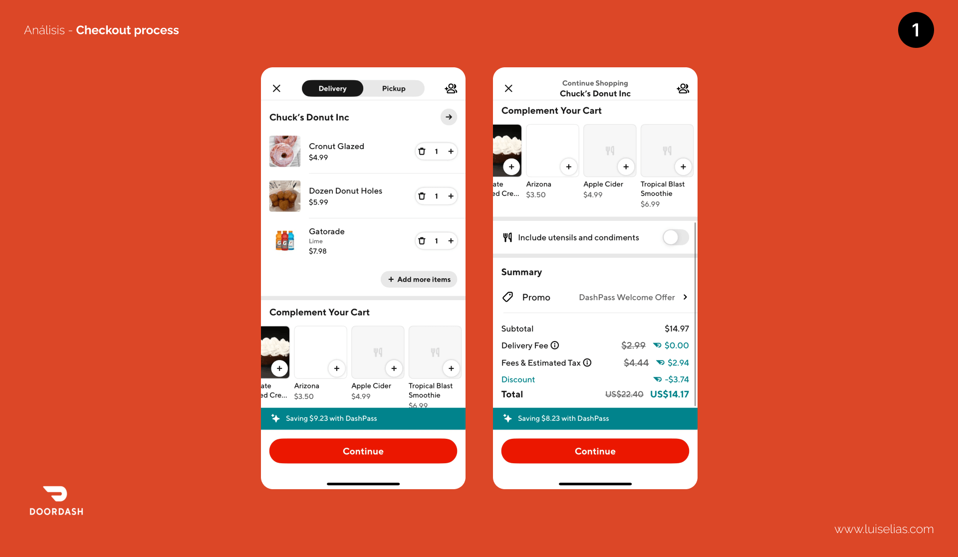
Steps: 4
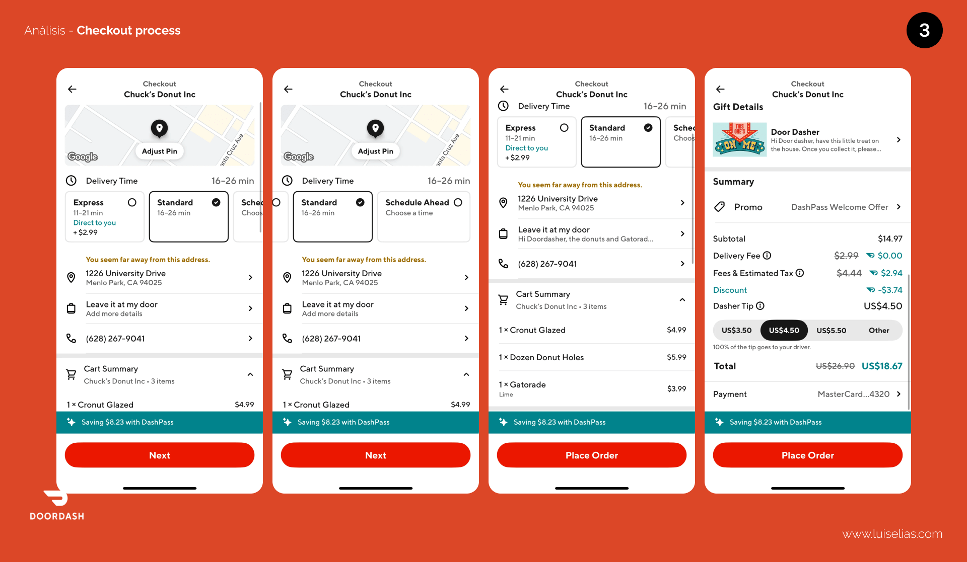
Pros:
- Quick path with just four steps, allowing easy customization or updates.
- Well-used iconography that compacts information without needing labels, provided the icons are clear and globally understandable.
- The utensils and condiment toggle helps reduce waste.
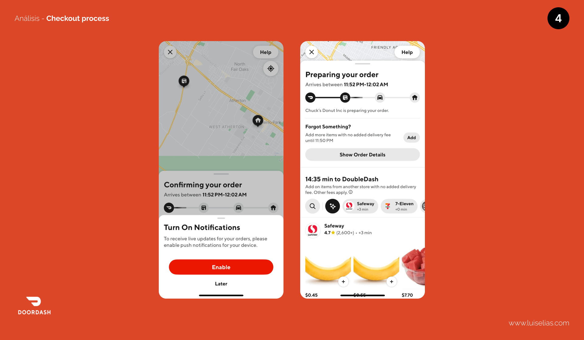
Cons:
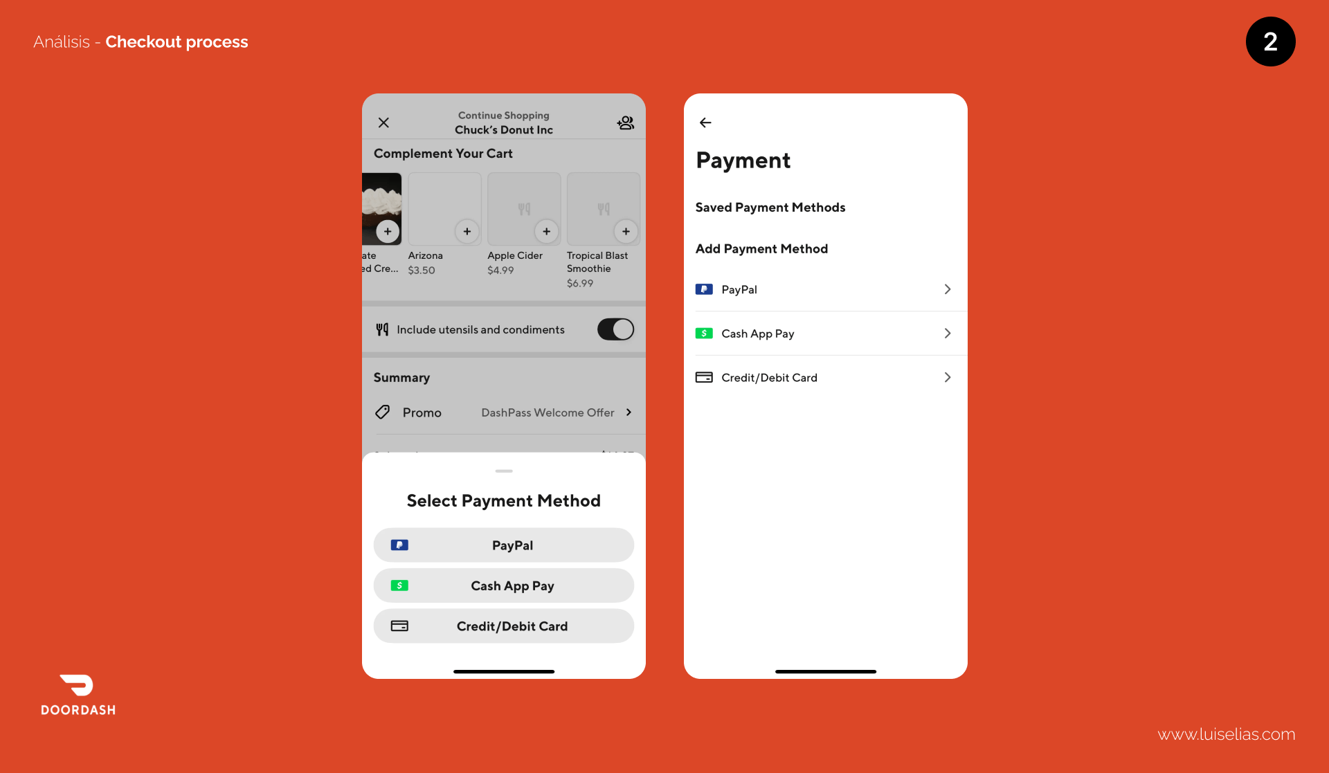
- The condiment toggle is a good start but too vague. Users with allergies need specific options to ensure their food is safe.
- Delivery time is shown twice, which is redundant.
- A missing confirmation page can confuse users. It’s important to confirm payment with a final click.
Other Interesting Points:
- Push notifications are requested at a functional time, which users appreciate.
- A fixed button can be useful in compact checkout pages.
- Improved product images could enhance the user experience, though not directly related to the checkout process.
Glovo
Glovo provides access to any product in your city within minutes, not just food delivery.
Checkout Process:
Steps: 5
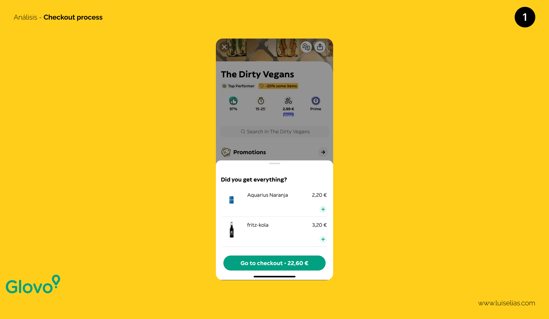
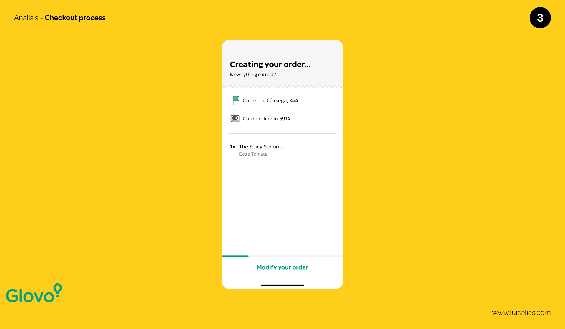
Pros:
- Simplified design with more space between elements, making it clear and concise.
- An allergy information box accommodates special dietary needs.
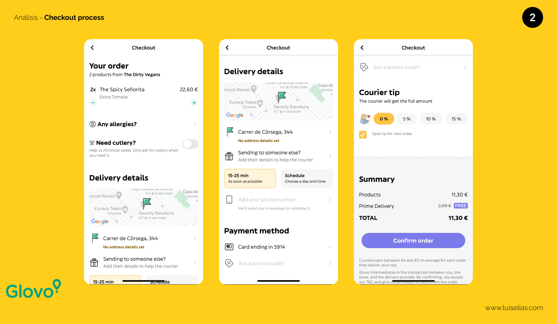
Cons:
- Inconsistent iconography and confusing design elements.
- The placement of the add/remove item icons is non-standard.
- The custom tip calculation is not intuitive.
Other Interesting Points:
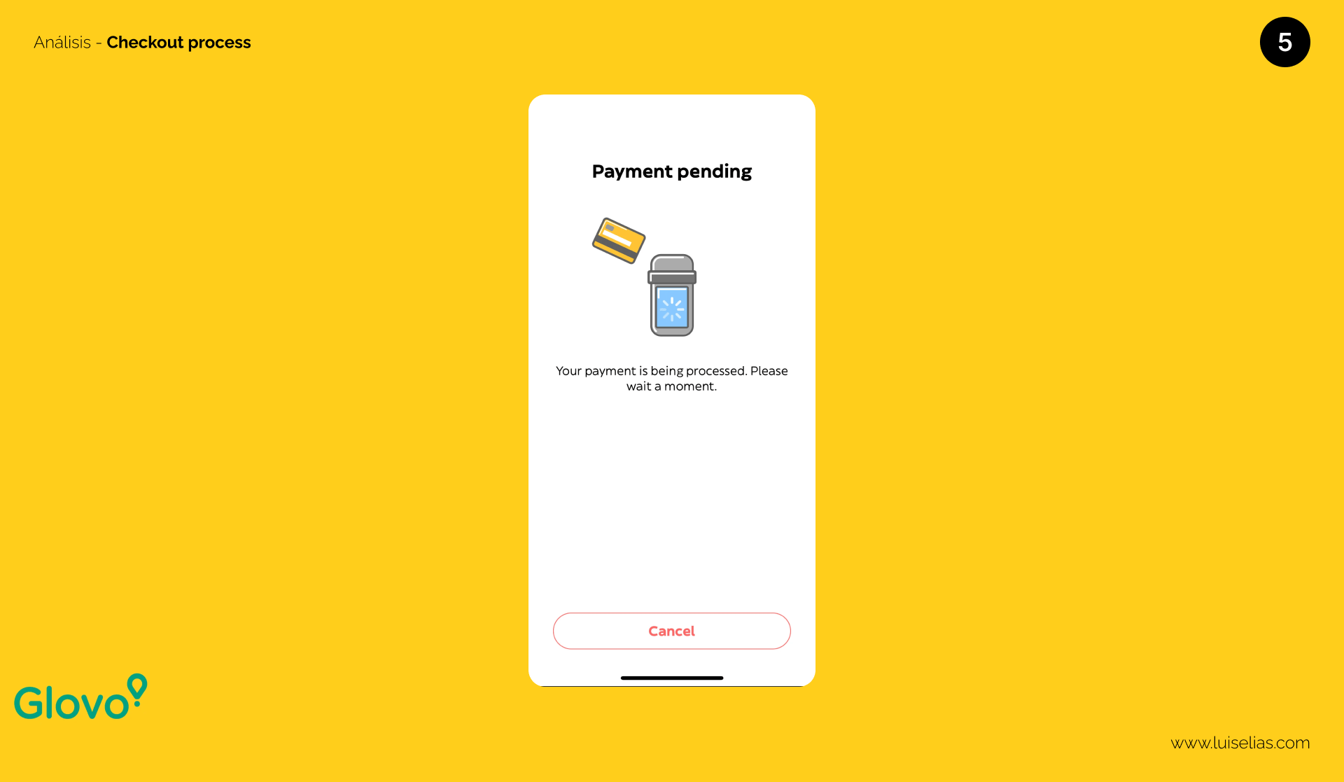
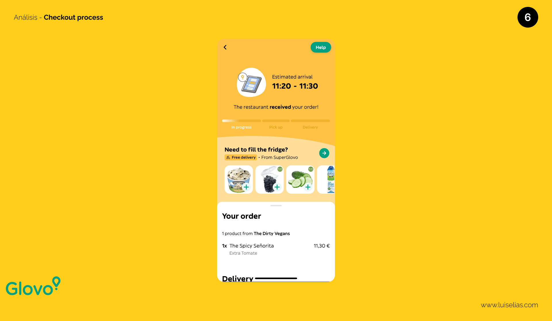
- Sending orders as gifts is a nice feature, similar to Uber Eats.
- A separate payment step can be problematic if the connection is lost or the app crashes. What do you think about this?
Bonus: Figma Material
Congratulations on making it this far! As a reward, I’m giving you access to the Figma page with all the screenshots used in this article for your analysis.
Please enter your email so I can send it to you for later use.
If you like my content, please subscribe to my YouTube channel and follow me on social media. Let’s create better products together! Don’t forget to leave your comments.