Thousands of transactions are occurring in online commerce, ranging from subscriptions to selling physical or digital products, event tickets, plane tickets, and many other things.
So if your product or the product you work on processes payments, it must have an effortless, intuitive, and most importantly, converting purchase flow.
If you are interested in learning about digital products, seeing what happens in the digital world, analyzing the user experience, and staying at the forefront of technology, this is your place.
If you don’t know me yet, I am Luis Elias. I am dedicated to the design and development of digital products, and with over 5 years of experience, I invite you to analyze checkout pages today.
Definition: A checkout page is the final part of the purchase process when the customer confirms the cart with the selected products or services, enters their information and completes the payment.
It is a crucial part of sales conversions.
The checkout page is not everything; many factors are involved in the conversion rate, ranging from technical aspects like loading time and performance to elements of the purchase flow, or even the product itself.
By the way, I have an article analyzing the entire purchase flow of three famous food delivery apps that you should read after reading this article if you want to see what the big players are doing.
Main reasons for checkout abandonment
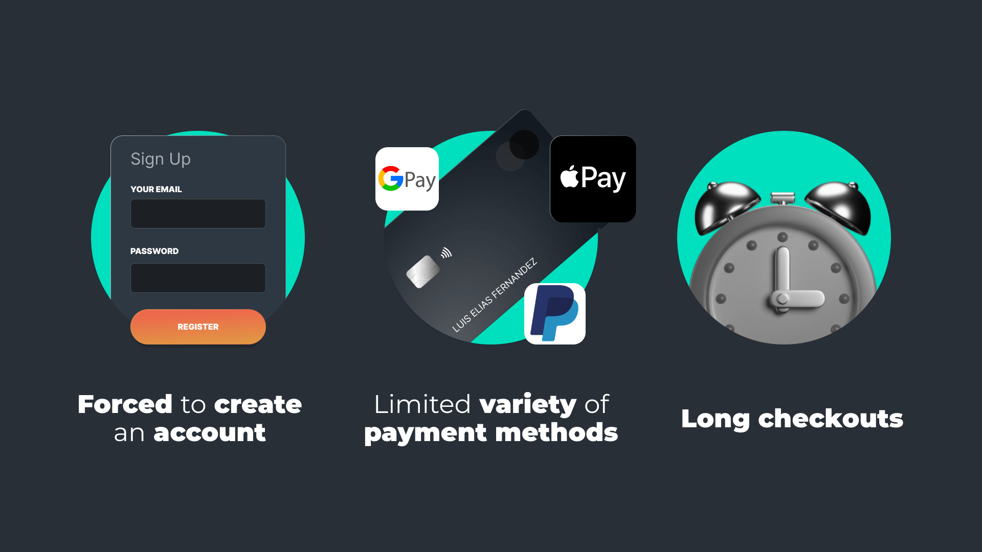


In this analysis, although there are many reasons why a checkout might work or not, we will focus on three characteristics that affect all payment carts regardless of the industry, and which we can address.
- Being forced to create an account to pay.
- Limited variety of payment methods.
- Long checkouts.
Let’s talk a bit about each one.
Being forced to create an account to pay.
Many users want to pay and leave, only; obviously, this point depends a lot on the end-user’s culture. Some audiences prefer to create an account while others are comfortable paying with their preferred payment method and having all shipping information inherited from the wallet without filling it out manually.
Did you know? Facebook’s requirement to advertise using Meta’s advertising services is that websites allow consumers to purchase without forcing account creation.
Limited variety of payment methods
Not only the limited variety of payment methods but also not offering trusted payment methods will make the user not complete the purchase. After all, who wants to enter their card information on any processor? It’s not just about the processor but also information about protected purchases, refund policies, and even the availability of the SSL certificate plays an important role.
Long checkouts
From loading time, and many unnecessary steps to an off autocomplete can cause our users to decide not to make their purchases. It should be noted that this does not mean that one-step checkouts work for everyone; of course not, it depends on multiple factors that adapt to the reality of each online store.
Analysis of online stores and their checkouts
Let’s look at a couple of checkout examples from some of the most popular stores and technologies.
Shopify Checkout
We must start with the undisputed Shopify. For better or worse, Shopify is a major player when it comes to setting up an online store, used by both big brands and local businesses, so analyzing what they offer on this page is crucial.
One-step checkout
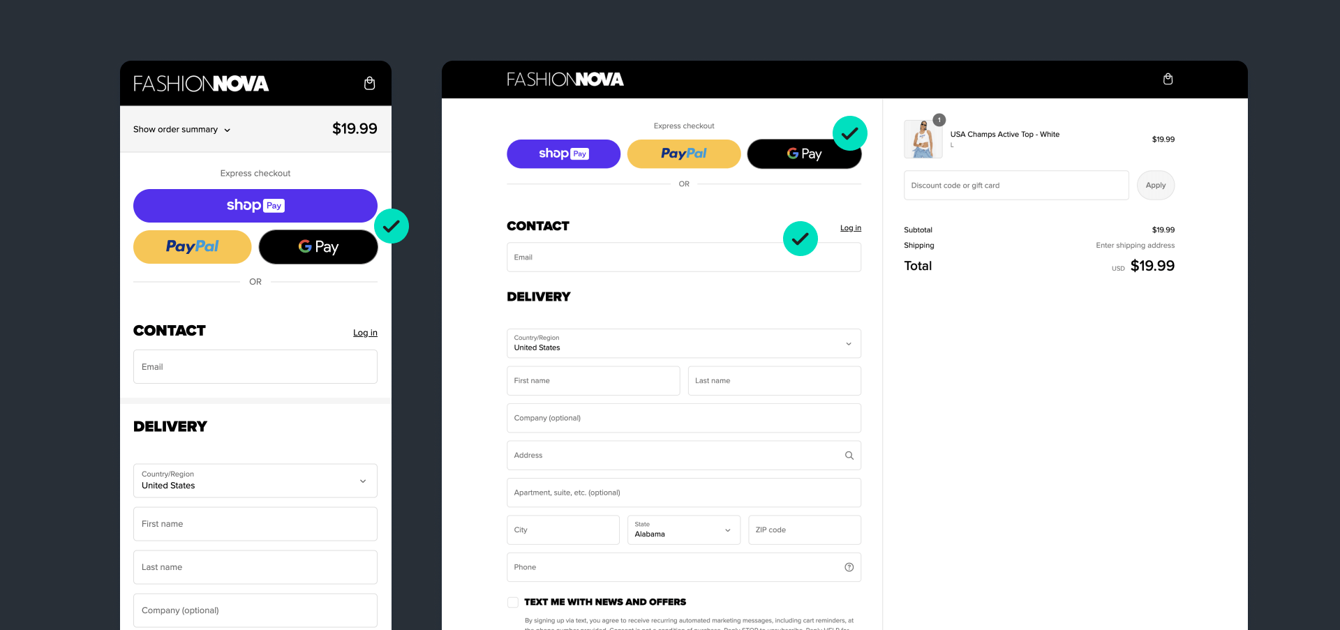
Let’s look at the first of them: FashionNova.
They have a one-step checkout. If we review the first point of the reasons for the highest drop-off in a checkout – forcing account creation – here Fashion Nova uses optional account creation. The login button is barely noticeable, with just entering the email, which by the way is autocomplete, being enough.
They did not skimp on payment methods. Besides offering express checkout as the first option, making them the most obvious choice, they also add the store’s methods, showing card logos and the PayPal option.
Tip: Neil Patel reports that adding PayPal to checkout can increase sales by up to 16-18%. Advertising? I don’t know, but the data is there. Source: See Nail Patel’s reel.
Regarding point 3, about long checkouts, Fashion Nova has an advantage, because if Shopify knows how to do something well, it is optimizing all the technical aspects of their checkout pages. Therefore, the page loads quickly on mobile and desktop and looks good on any device.
Multi-step checkout.
If we analyze the checkout of JeffreeStarCosmetics.com as an example of Shopify’s multi-step checkout, we see that in principle all Shopify checkouts are similar, only that this one is divided into information, shipping, and payment.

They always show a summary of the order information, this is important in multi-step checkout, so people can confirm that the info is correct.
This website offers a wide variety of payment methods, a good point for them here.
An interesting feature to explore is giving a checkbox for a freebie, it is a sales driver, as the user perceiving this gift promotes completing the purchase to receive it.
These strategies must be evaluated because they do not always work for all models.
Apple Checkout
Now let’s step out of the Shopify universe and see what happens with another giant like Apple. This checkout is quite peculiar in its approach. While it doesn’t follow the traditional layout of a checkout like Shopify does, it has certain peculiarities from which we can learn.
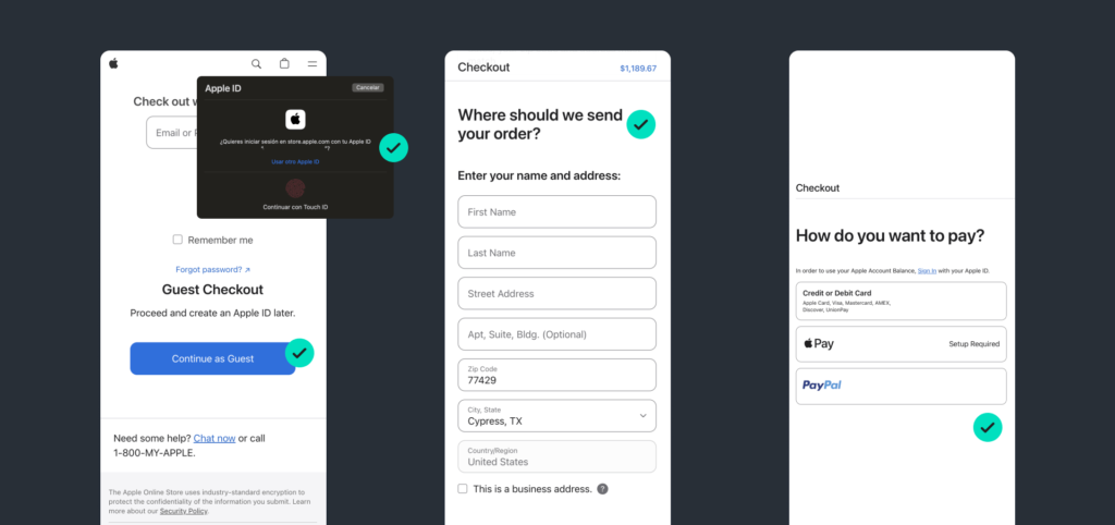
Apple follows the standard of allowing guest purchases and goes a step further since if they recognize that you are on an Apple device, you can log in quickly without passwords.
If we proceed within the flow, we see that Apple opts for a multi-step flow, and at each step tries to reduce noise by focusing the user on one action at a time.
And of course, Apple offers multiple payment methods so users can pay with their preferred method.
On the third point, “long checkouts,” Apple balances what is excessive with what is fair. Feature that, if you are observant and look beyond the design, you will notice that Apple justifies and explains at each step why they ask for the information. Nice, don’t you think?
Additionally, it does not use generic titles for each section; they go from: “Payment Information”, to “How would you like to pay?” Simulating what would be in-person attention while maintaining their friendly tone.
Amazon
For better or worse, we have to talk about the e-commerce giant, Amazon, and I say this because I don’t love the solutions they offer at the product level. I think their success lies more in being pioneers and their market size than their digital product. Comment on what you think about it.
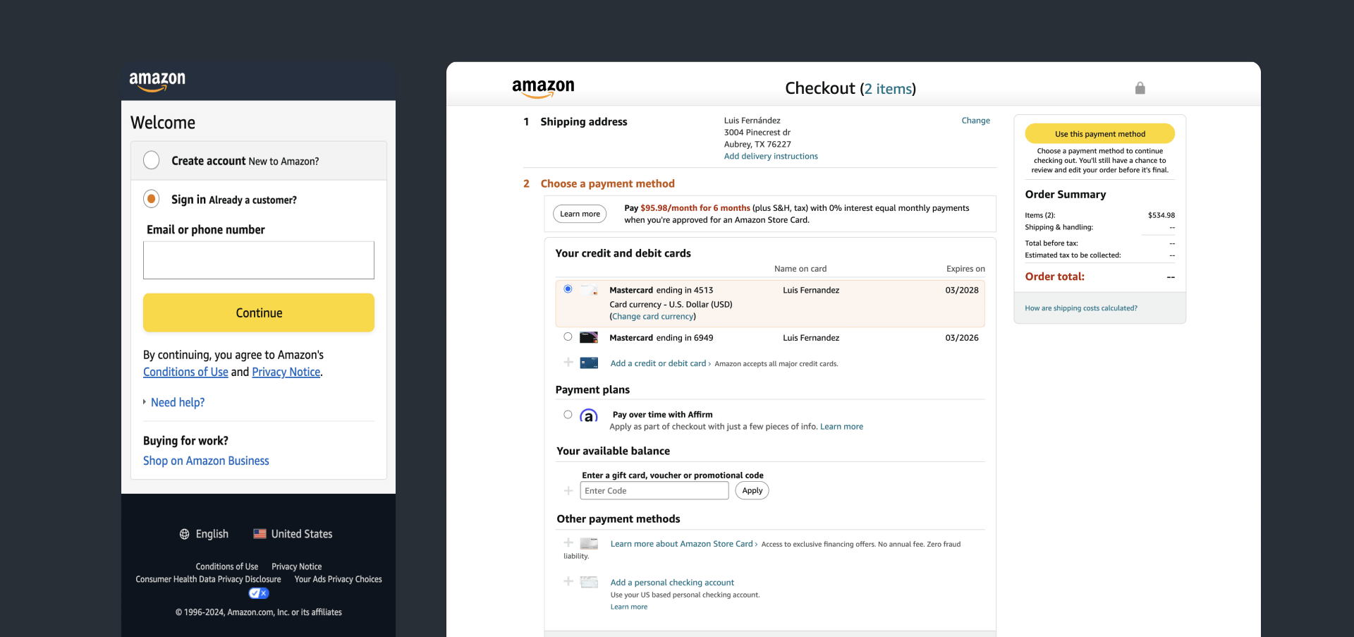
Regardless of my opinion, they must be doing something right. Let’s look at their checkout and analyze it.
On the first point, accessing with an account is mandatory. Considering the volume of users who have an account on Amazon, this wouldn’t be an issue initially, but from here to this working for all products… I have my doubts, but let’s continue.
Payment methods, here forget about PayPal, much less Google Pay, Apple Pay, none of that. You enter your card or a gift card or forget about buying.
On the third point, compared to other online stores, they have a somewhat extensive flow. However, if you have the information preloaded, it could be pretty fast.
A point in their favor is that their checkout process eliminates distractions. Once you enter the payment flow, the entire interface changes, with zero distractions, and returning to the previous step or the marketplace itself is not obvious, thus forcing the user to proceed in the flow.
What works against them is the amount of content displayed, which can be overwhelming.
What do you think about this payment process? What is your theory of Amazon’s success?
Conclusions
To summarize, if you are building a payment flow, keep in mind the three main reasons why conversions may be affected.
Analyzing what your direct and indirect competitors do could help you, not because you should copy, but following Jakob’s Law.
Users spend most of their time on other sites. This means that users prefer your site to work the same way as all the other sites they already know.
Jakob’s Law
Try to recreate solutions that your users already know so they can better flow through a payment process they are already familiar with and don’t have to figure out how yours works.
By the way, if you want the materials used in this analysis, you can download them from this link.
If you want to contribute ideas for new content, other payment flows, or any interesting thing you want to share, go ahead!